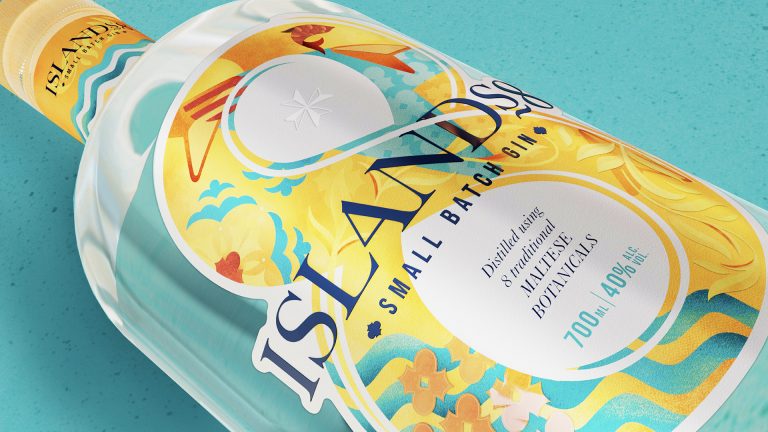
Islands8, a groundbreaking Maltese gin, has just relaunched with a new brand system and packaging identity by brand acceleration agency bluemarlin.
Islands8 is the brainchild of brother and sister startup founders George and Annabel Xuereb. George, a mechanical engineer, and Annabel, a dental hygienist, embarked on their extraordinary journey to create Malta’s first truly national gin during Covid, when both their professional lives were grounded.
Despite Malta’s limited history as a gin-drinking destination, George and Annabel wanted to introduce a brand that would lead the charge in igniting a gin culture across the archipelago, like that experienced in the UK in recent years.
They set about creating ‘a taste of Malta’ with a gin blend that comprises juniper berries and eight indigenous botanicals: marjoram, thyme, rosemary, sage, dill, aniseed, fennel and mint.
However, the brand failed to stand apart from global competitors and make a significant mark. It needed a new and evolved identity that stood out, made an impact and celebrated its true identity as a cultural icon.
The entrepreneurs approached bluemarlin because of its track record in working with and investing in startups – and because it has delivered some of Malta’s most iconic drinks brands to date, including national beer Cisk and soft drink Kinnie.
“This gin is all about Malta, so we wanted to partner with an agency that really understood the importance of our culture,” Annabel Xuereb said. “bluemarlin came to mind because it invests significantly in on-the-ground research and building a true understanding of a nation’s values and nuances.
“The bluemarlin creative team has come up with a brand system that speaks to the gin itself and embodies Maltese culture in ‘spirit form’.”
bluemarlin has a long history of supporting promising new businesses. Andrew Eyles, the agency’s founding partner and CEO, said: “Over our 30-year history, we’ve partnered with some of the biggest brands in the world, but we’re always looking for young companies to back with the benefit of our experience – and, of course, they help us keep our own creative energies primed.
“We partnered with Islands8 because George and Annabel wanted to do something different. We saw it as an opportunity to evolve the story of gin and move it away from botanical tropes.”
The brand identity and packaging design for Islands8 is a testament to the craftsmanship, culture and natural beauty of Malta. bluemarlin carefully wove these elements into the design, incorporating intricate details reminiscent of Maltese craftsmanship, including the ironwork and woodwork found all over the islands, as well as the tile patterns that reveal so much about the history. The label also subtly incorporates the Maltese cross, a symbol of the country’s heritage, in a way that honours tradition while embracing modernity. And the warm terracotta and aqua colourway represents the sunny climate and impressive seascapes.
The creative strategy deliberately zoomed in on Malta, steering clear of the tired clichés associated with the gin industry, which resulted in a refreshing and distinctive brand identity. So, while botanicals play a crucial role in the gin’s flavour profile, the label design primarily focuses on capturing the vibrant essence of Malta itself.
“We’ve created a pack design and brand system that feels proudly and uniquely Maltese, sits well with the national consumer base and target demographic, whilst being disruptive enough to punch above its weight in a market dominated by established international brands,” Gareth Roberts, Design Director at bluemarlin, said.
“My sister and I could feel bluemarlin’s passion and dedication shining through at every stage of the process,” George Xuereb said. “The result? A product that effortlessly catches the eye on-shelf and in optic line-ups.”

